Account
Login
Cart
 Order Sample
 View Bestsellers
 Fast Delivery
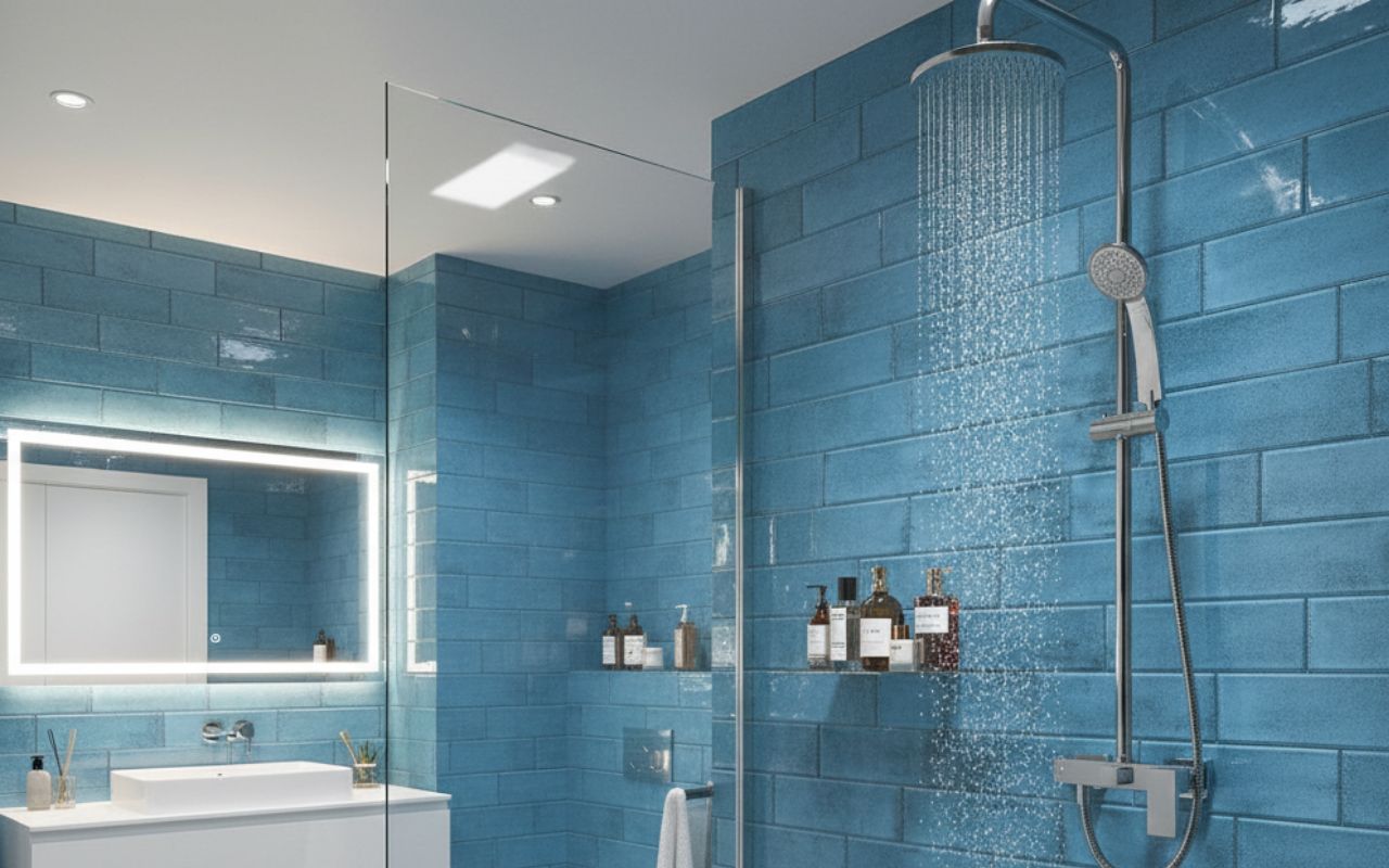
Trending colours in metro tiles for 2026
The trending colours in metro tiles for 2026 focus on calm, depth and longevity rather than short-lived fashion. Designers and homeowners alike are moving towards hues that shape mood, support everyday living, and age gracefully over time. So which colours will define metro tiles in 2026 and which of them will still feel right years from now?
Key takeaways
- Earthy greens and deep blues dominate metro tile trends for 2026.
- Soft pastels return in muted, more sophisticated forms.
- Tile finish significantly changes how colour is perceived.
- Trending colours work best when applied to defined zones, not entire spaces.
- Long-term satisfaction comes from balancing trends with personal style.
Why do colour trends matter when choosing metro tiles?
Colour trends matter because metro tiles are often used as long-term surfaces in kitchens and bathrooms, not as easily replaceable accessories. The colour you choose will influence how a space feels every day – whether it feels calm or energetic, spacious or cocooning, timeless or trend-led.
That does not mean trends should be followed blindly. Instead, they are best understood as indicators of wider lifestyle shifts. In 2026, colour trends reflect a move towards interiors that feel grounding and emotionally supportive.
When selecting metro tile colours, it is worth balancing trend awareness with personal taste and the character of your home, ensuring the final choice feels considered rather than reactive.
Why are earthy greens dominating metro tile trends in 2026?
Earthy greens are dominating metro tile trends in 2026 because they respond to a growing desire for calm, nature-inspired interiors. Shades such as sage, olive, moss and forest green create a sense of quiet richness without feeling overpowering, making them suitable for both compact splashbacks and full-height tiled walls.
These greens work well across styles, from modern kitchens to more classic bathrooms because they feel rooted in natural palettes rather than seasonal colour cycles. Their multipurpose nature allows them to pair comfortably with wood, stone and brushed metals, creating interiors that feel layered and enduring.


Are deep blues and teal shades the new modern classic?
Deep blues and teal shades are emerging as a modern classic because they bring drama and elegance without the heaviness of black or very dark grey. These moody tones add depth to metro tile installations, giving kitchens and bathrooms a more tailored, architectural feel while remaining surprisingly versatile.
In lighter spaces, deep blues provide contrast and structure, while in darker or more intimate rooms they enhance a sense of atmosphere and calm. Teal, in particular, bridges the gap between blue and green, making it easy to combine with both cool and warm materials. As a result, these shades feel contemporary yet grounded, offering a refined alternative for those who want something bolder than neutrals but more enduring than fleeting colour trends.


Why are soft pastels making a quieter comeback?
Soft pastels are returning in a more restrained, grown-up form because interiors are shifting towards warmth and subtlety rather than high-contrast statements. Muted pinks, warm neutrals and dusty blues introduce colour without dominating a space, making rooms feel lived-in rather than styled for impact.
These tones work particularly well in homes that prioritise comfort and longevity over bold visual statements. When used on metro tiles, pastels soften hard surfaces and create a gentle backdrop that supports everyday living, especially in smaller kitchens or bathrooms where strong colours could feel overwhelming.
If you are keen to explore how different metro tiles might work in your own space, Top Ceramics offers a Free Tile Visualiser that lets you test colours and layouts within a virtual version of your interior, making the design process far more intuitive. Once the visualisation is ready, you can also receive a complete list of products, so you don’t have to search for individual items in other shops.


How do finishes change the way colour looks on metro tiles?
Finish changes how colour is perceived just as much as the shade itself. Gloss metro tiles reflect light, making colours appear brighter and more defined, which can lift darker spaces but may also make strong colours feel more intense. Matte finishes absorb light, softening colour and giving tiles a calmer, more contemporary presence.
Handcrafted or textured finishes introduce subtle variation, preventing flat colour from feeling clinical. Slight surface irregularities add depth and warmth, which is why the same colour can feel vibrant in gloss but quietly sophisticated in a softer, tactile finish. Choosing the right finish is therefore essential to achieving the mood you want, not just the colour you like.
Looking for metro tiles that will perfectly complement your interior?
Check out our metro tiles and choose the perfect model! You can also see how specific tiles will look in your interior with the Free Tile Visualiser.
Where do trending metro tile colours work best in real homes?
Trending metro tile colours work best when applied thoughtfully to specific zones rather than everywhere at once. Splashbacks are ideal for bolder or deeper shades, as they allow colour to define the kitchen without overwhelming the room. Bathrooms benefit from earthy greens and deep blues, which create a calm, cocooning atmosphere well suited to relaxation.
Feature walls offer an opportunity to experiment with richer tones or textured finishes, while unexpected spaces such as utility rooms, cloakrooms or hallways can carry colour with confidence. In these smaller areas, trending colours add personality without the commitment of large, open-plan surfaces, allowing homeowners to enjoy colour in a controlled and considered way.
Conclusion – Embrace colour, test trends, but stay true to your style
Trends can be a valuable source of inspiration, but they should never override the character of your home or your personal preferences. The most successful interiors use trending colours as a guide rather than a rule, adapting them to suit scale, light and everyday life.
By embracing colour thoughtfully, testing how it behaves in your own space and choosing finishes with care, you can enjoy metro tile trends in a way that feels both current and enduring.