Account
Login
Cart
 Order Sample
 View Bestsellers
 Fast Delivery
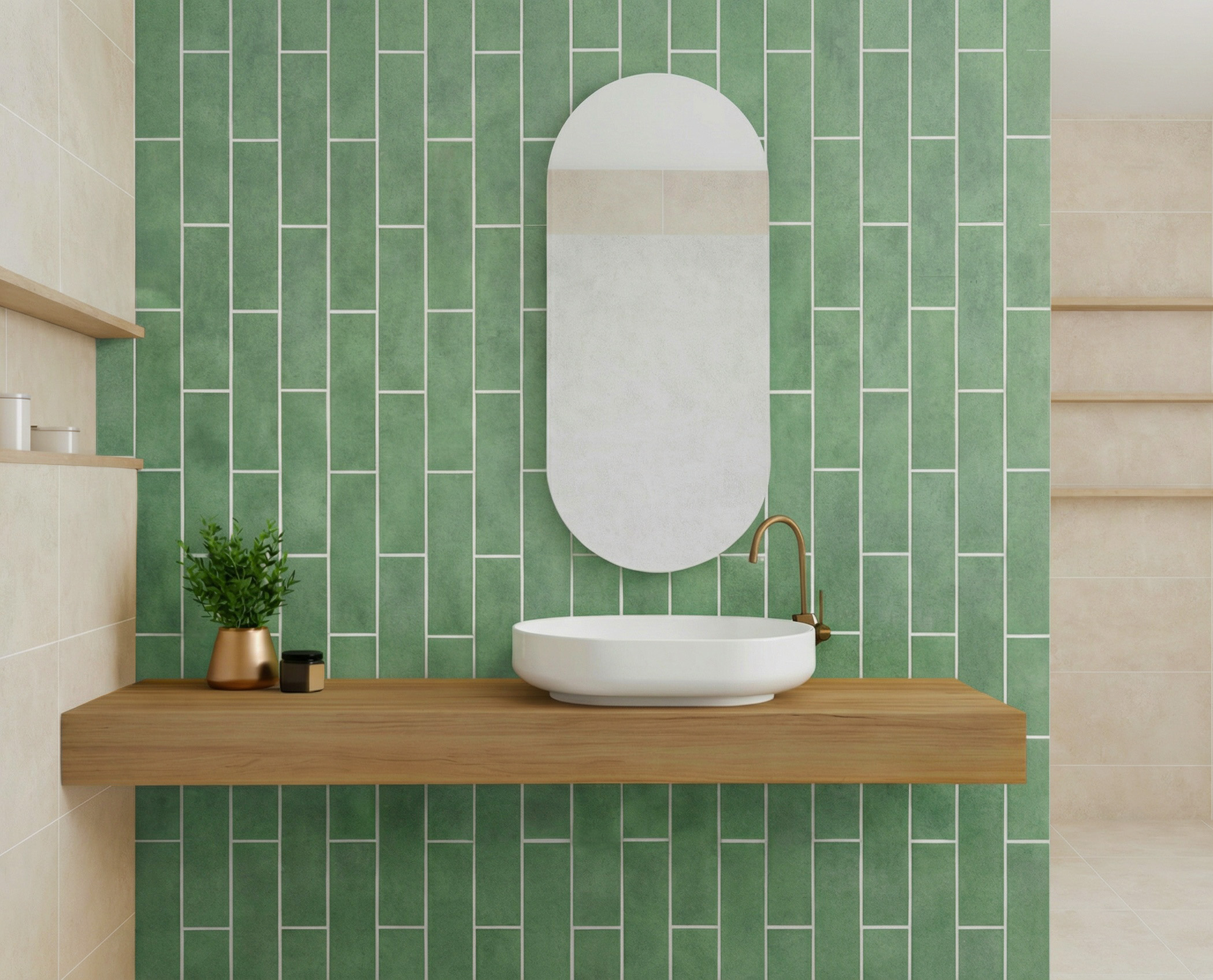
Best colour combinations with green tiles
Green tiles are surprisingly capable of creating both calm, natural spaces and bold, energetic statements. The key lies in pairing them with colours that either harmonise or provide thoughtful contrast. But which combinations truly bring out the best in green tiles and elevate your interior without overwhelming it?
Key takeaways
- Neutral colours such as white, grey, beige and cream pair effortlessly with green tiles.
- Contrasting tones, from terracotta to navy, add depth and energy when used thoughtfully.
- Layering multiple shades of green creates dimension and richness.
- Consider lighting, room size and function when balancing colours.
- Tools like the Free Tile Visualiser help preview and test combinations before installation.
Where can you use green tiles?
Green tiles are not confined to a single room or style – their adaptability makes them suitable for multiple surfaces. In kitchens, they work beautifully as splashbacks, framing cabinetry while introducing freshness.
Bathrooms benefit from green tiles as walls or floors, creating a spa-like, soothing atmosphere. Feature walls in living areas or hallways also respond well to green, providing a striking focal point.
Even small spaces, such as cloakrooms or utility rooms, can carry green tiles with confidence, especially when combined with lighter tones or reflective surfaces. The power of green allows for subtle, natural schemes or more dramatic, statement-making designs depending on your taste and the room’s purpose.
Which neutrals pair best with green tiles?
Neutral colours provide a safe yet sophisticated backdrop that allows green tiles to shine without competing for attention.
- White creates a crisp, timeless look that brightens spaces and highlights the vibrancy of green tiles.
- Grey harmonises with both light and dark greens while adding a modern touch.
- Beige and taupe bring warmth and earthy balance, particularly effective with muted or olive greens.
- Cream softens the contrast, producing a classic and calming feel, ideal for bathrooms or traditional kitchens.
Using neutrals strategically ensures the green tiles remain the focus while maintaining an elegant, coherent aesthetic throughout the space.
How to use contrasting colours with green tiles?
Contrasting colours can elevate green tiles from simple surfaces to statement features, but the key is careful, considered use. The right contrast highlights the vibrancy of green without overwhelming the eye.
- Warm tones such as terracotta, blush or mustard add energy and a subtle warmth to muted greens, perfect for kitchens or cosy bathrooms. Terracotta accents in particular can make olive or sage tiles feel more grounded and natural.
- Deep, moody hues like navy, charcoal or aubergine add sophistication and a sense of luxury. These shades are particularly effective on feature walls, in larger kitchens, or behind open shelving where green tiles need a dramatic backdrop.
- Bright accent colours such as yellow or coral provide playful highlights. Use these sparingly in trim, accessories or patterned inserts to inject personality without cluttering the design.
The overall principle is to use contrast to create visual interest while maintaining harmony. Too many competing colours can make the space feel busy, whereas carefully chosen contrasts enhance green tiles, making them the hero of the room.


Can green tiles be paired with other shades of green?
Layering different shades of green is one of the most sophisticated ways to create depth and texture in a room. When done thoughtfully, it produces a dynamic yet cohesive look that feels organic and intentional.
- Light vs dark greens create dimension and subtle movement. Lighter shades like mint or sage can recede slightly, while deeper tones such as emerald or forest draw the eye and anchor the design.
- Ton-sur-ton combinations give a harmonious, cohesive feel, ideal for bathrooms or living areas where a calm, enveloping palette is desired.
- Olive with emerald or moss conveys a luxurious, natural palette reminiscent of gardens and forests, blending effortlessly with wood, stone, or brass accents.
When pairing greens, crucial is an attention to undertones. Cool greens combined with warm greens can clash if the balance isn’t carefully considered. Thoughtful layering, however, ensures the tiles feel rich and nuanced, creating a timeless backdrop that works across kitchens, bathrooms, and feature walls alike.
How to balance colour combinations in different rooms?
Balancing colour combinations with green tiles requires attention to room function, lighting and scale. In kitchens, contrasting colours or layered greens can create focal points on splashbacks or cabinetry, while neutrals on walls and floors prevent the space from feeling busy. Bathrooms benefit from softer palettes, such as sage with cream or muted pastels, which encourage a calm, spa-like atmosphere.
In living areas or feature walls, combining mid-tone greens with earthy accents, natural woods or subtle metallics creates depth without overwhelming the eye. Always consider how light interacts with the surfaces: darker rooms may need lighter or warmer contrasts to keep spaces feeling open, whereas bright spaces can accommodate deeper, more dramatic tones without feeling oppressive.
The key is to achieve harmony, even when using bold or multiple colours, ensuring each element supports the overall mood.
Are you searching for the perfect green tiles that will blend beautifully into your interior?
Check out our bestsellers! We also recommend using our Free Tile Visualiser, where you can see how a specific model will look in your interior!
Tools and tips for testing green tile combinations
Before committing to a colour scheme, essential is testing combinations in context. Physical samples of tiles and paint swatches allow you to see how shades interact under different lighting conditions.
For a more comprehensive approach, at Top Ceramics we provide a Free Tile Visualiser. This tool lets you digitally recreate your room, experiment with different tile colours and layouts, and visualise which combinations work best with your green tiles. Using a visualiser reduces the risk of surprises after installation and gives you confidence in your final choice.
Additional tips include creating digital mood boards, photographing samples in your space at different times of day, and considering textures as well as colours, since finishes can dramatically alter the perceived tone of a green tile.
Conclusion
Green tiles are practical, but their success in any room depends on careful colour pairing and thoughtful balance. By combining neutrals, contrasts, and layered greens while considering lighting and scale, you can create interiors that feel both cohesive and personalised. Tools like Top Ceramics’ Free Tile Visualiser make it easier to test ideas and ensure your combinations work before installation, helping green tiles look their absolute best.
