Account
Login
Cart
 Order Sample
 View Bestsellers
 Fast Delivery
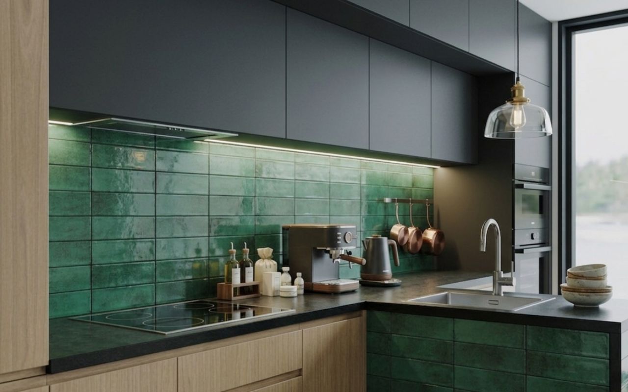
Green metro tiles: Classic style for kitchens & bathrooms
Green metro tiles combine one of the most popular tile shapes with one of today’s most sought-after colours, making them a practical and stylish choice for kitchens, bathrooms and beyond. Available from around £20–£35/m², they suit everything from splashbacks to full walls in various layouts. But how do you use them to get the best result?
Key takeaways
- Green metro tiles combine timeless shape with a practical, on-trend colour.
- Different shades create different moods, from calm (sage) to dramatic (dark green).
- Layout patterns significantly influence the final look and spatial perception.
- They work equally well in bathrooms, kitchens and beyond.
- Finish and grout colour are key decisions that shape the overall design.
Why are green metro tiles a timeless design staple?
Green metro tiles remain a design staple because they bring together simplicity and flexibility in a way few materials can match. The classic metro (or subway) format has been used for over a century, proving its ability to adapt to changing styles without losing relevance.
What makes green metro tiles particularly appealing today is the balance between tradition and trend. The familiar rectangular shape keeps the look grounded, while the green colour introduces freshness, depth and a connection to nature.
They are also a highly accessible design option. Typically priced between £20 and £35 per square metre, they offer strong visual impact without requiring a premium budget. Their flexibility means they can be used across multiple spaces, including:
- bathrooms and shower walls,
- kitchen splashbacks and feature areas,
- utility rooms and hallways.
This combination of affordability and adaptability is accurately what keeps them consistently popular.
How do different shades of green metro tiles change the look?
The shade of green you choose has a significant impact on the overall atmosphere of your space. From soft and calming to bold and dramatic, each variation brings a different energy to the room.
Lighter tones tend to reflect more light and create a sense of openness, while darker shades introduce depth and contrast. The undertone – whether warm, cool or neutral – also influences how easily the tiles pair with other materials.
Choosing the right shade is less about following trends and more about matching the colour to your interior style and how you want the space to feel.
Sage green metro tiles
Sage green metro tiles are the most popular option for a reason. Their soft, muted tone acts almost like a neutral, making them easy to incorporate into a wide range of interiors without overwhelming the space.
They are particularly effective when used across larger areas, such as full walls, where their subtle colour creates a calm and cohesive backdrop. This makes them ideal for bathrooms and kitchens aiming for a relaxed, modern feel.
If you are looking for a softer palette, the light green tile range includes delicate sage metro options that work beautifully in both contemporary and classic settings.
Emerald green metro tiles
Emerald green metro tiles are bold, rich and instantly eye-catching. Their jewel-like tone brings a sense of luxury and depth, making them perfect for spaces where you want to create a strong visual statement.
They work especially well in smaller, focused areas where the intensity of the colour can be appreciated without dominating the entire room. Used correctly, they elevate even simple layouts.
Emerald tiles are best suited for:
- feature walls that draw attention,
- kitchen splashbacks with contrast,
- shower niches or recesses.
They bring drama without compromising elegance.
Dark green metro tiles
Dark green metro tiles introduce a more moody and sophisticated feel. Often associated with Victorian-inspired interiors, they add depth and character to a space while maintaining a timeless quality.
They are particularly effective in rooms where you want to create a sense of intimacy or drama. When paired with lighter elements, they form a balanced and refined composition.
Dark green tiles work well in:
- period properties with traditional detailing,
- compact powder rooms,
- kitchens designed with strong contrast in mind.
They create impact without feeling overly modern or trend-driven.
Mint / aqua green metro tiles
Mint and aqua green metro tiles bring a lighter, fresher energy. Their slightly retro character makes them ideal for interiors inspired by coastal or vintage styles.
These shades reflect light well, helping to brighten smaller or darker spaces. They also introduce a playful element without becoming overwhelming.
They are particularly suited to:
- bathrooms with a relaxed, airy feel,
- laundry rooms or utility spaces,
- kitchens that benefit from a touch of colour.
This makes them a great option when you want something distinctive yet approachable.
Are you looking for green metro tiles that would be perfect for your kitchen or bathroom?
Have a look at our bestsellers and visualise your idea using the Free Tile Visualiser!
What are the most popular layout patterns for green metro tiles?
The way you arrange metro tiles can entirely change their visual effect. Even with the same colour, different layouts can make a space feel wider, taller or more dynamic.
Layout is not just a technical decision – it is a design tool that shapes how the room is perceived. Choosing the right pattern helps you highlight the strengths of both the tiles and the space.
Understanding a few key layouts allows you to move beyond standard designs and create something more considered.
Traditional brick bond (offset)
Brick bond is the most recognisable metro tile layout and remains the safest choice for timeless interiors. Its staggered pattern softens the grid and creates a natural rhythm.
The orientation also matters. Horizontal brick bond can make a wall feel wider, while a vertical version adds height and a more contemporary edge.
This layout works well in almost any setting, from classic kitchens to modern bathrooms.
Herringbone
Herringbone introduces movement and energy into a space. The angled pattern draws the eye and creates a sense of depth, even with simple tiles.
It is particularly effective in smaller areas where you want to add interest without introducing additional colours or materials. This layout offers a modern twist while still feeling refined and intentional.
Vertical stack bond
Vertical stack bond is one of the most contemporary options. Tiles are aligned in a clean grid, emphasising vertical lines and creating a minimalist aesthetic.
This layout is especially popular in modern bathrooms, where simplicity and structure are key design elements. It works best with consistent grout lines and high-quality finishes.
Cross-hatch / basket weave
Cross-hatch or basket weave layouts are more decorative and less common, making them ideal for statement areas. They introduce texture and visual complexity without relying on bold colours.
These patterns are best used selectively, such as in niches or feature walls, where they can stand out without overwhelming the design. They offer a more creative approach for those looking to do something different.
How can you use green metro tiles in a bathroom?
Green metro tiles are particularly effective in bathrooms, where they can create anything from a calm, spa-like retreat to a bold, dramatic space. The key is choosing the right shade and coverage.
A full shower wall in sage green is one of the most popular approaches, offering a soft and relaxing atmosphere. Alternatively, using tiles on only the lower half of the wall, combined with paint above, helps prevent the space from feeling too enclosed.
For more contrast, emerald tiles can be used in niches or recessed areas, adding depth and interest. In smaller powder rooms, floor-to-ceiling dark green tiles create a cocooning, high-impact effect that feels both modern and luxurious.
What are the best ways to use green metro tiles in a kitchen?
In kitchens, green metro tiles are most commonly used as splashbacks behind the hob, where they combine practicality with visual appeal. Their easy-to-clean surface makes them ideal for areas exposed to heat and moisture.
They can also be extended across an entire wall, particularly behind open shelving, where they act as a subtle yet decorative backdrop for everyday items. For those exploring broader options, you can browse the full range of green tiles to find complementary styles.
A more design-led approach involves wrapping a kitchen island in metro tiles, turning it into a focal point within the room. If you want to experiment before committing, our Free Tile Visualiser allows you to test layouts, colours and combinations in a realistic setting, helping you make more confident decisions.


Should you choose glossy or matt green metro tiles?
The choice between glossy and matt finishes has a direct impact on how your tiles look and perform. Glossy tiles reflect light, making them ideal for smaller or darker spaces where brightness is important.
They are also easier to wipe clean, which makes them particularly practical in kitchens and busy bathrooms. The reflective surface enhances colour depth and gives a slightly more polished appearance.
Matt tiles, on the other hand, offer a softer and more understated finish. They absorb light rather than reflecting it, creating a more relaxed and contemporary feel. They are often chosen for larger spaces or feature walls where subtlety and texture are preferred.
What grout colour works best with green metro tiles?
Grout colour plays a crucial role in the final look of green metro tiles. It can either highlight the layout or create a more seamless surface, depending on the effect you want to achieve.
White grout is the most classic option, emphasising each tile and creating a clear grid pattern. Matching grout tones offer a more modern, unified look, while darker grout introduces contrast and is often more forgiving in terms of maintenance.
If you are unsure which option will work best, it is worth exploring different combinations in more detail. Read our guide What colour grout for green tiles?, to understand how grout choices can transform the final result.
FAQ
Are green metro tiles easy to install?
Green metro tiles are relatively easy to install compared to more complex tile shapes. Their consistent size and straight edges make alignment straightforward, especially in standard layouts like brick bond.
What size are standard metro tiles?
Standard metro tiles typically come in sizes such as 7×30 cm, 6.5×25 cm and 10×30 cm. These proportions create the familiar elongated rectangular shape associated with subway tiles.
Different sizes can subtly change the look of the layout. Larger tiles feel more contemporary, while smaller ones maintain a more traditional aesthetic.
How many green metro tiles do I need per m²?
The number of tiles needed per square metre depends on their size. On average, smaller metro tiles require more pieces per m², while larger formats reduce the number needed.
It is always advisable to order extra tiles to account for cuts, waste and future repairs. A typical allowance is around 10% more than the calculated area.
What’s the difference between metro and subway tiles?
There is no real difference between metro and subway tiles – the terms are used interchangeably. Both refer to the same rectangular tile format inspired by early 20th-century underground stations.
The variation lies more in finish, size and colour rather than the name itself. In the UK, “metro tiles” is the more commonly used term.