Account
Login
Cart
 Order Sample
 View Bestsellers
 Fast Delivery
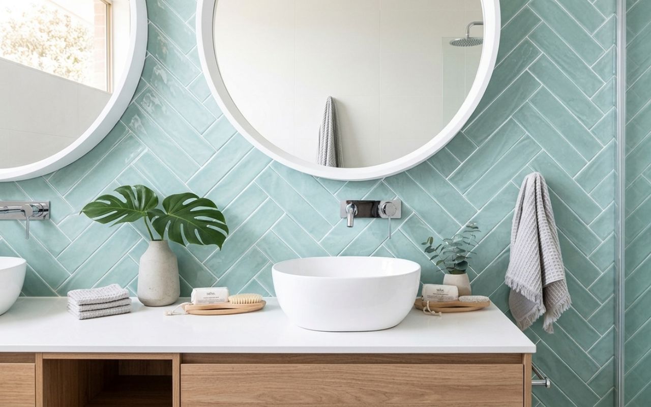
Light green tiles – Fresh ideas for bright, calming interiors
Light green tiles bring calm, natural freshness to any room while reflecting light and visually expanding the space. Shades like sage, mint and celadon work beautifully in kitchens and bathrooms, pairing effortlessly with white, wood and brass. But how do you choose the right tone and style to truly elevate your interior?
Key takeaways
- Light green tiles act as a soft alternative to traditional neutrals.
- Sage, mint and celadon each create different moods and suit different spaces.
- Bathrooms benefit from calming full-wall applications, while kitchens suit splashbacks.
- Neutral colours, wood and metals pair effortlessly with light green tiles.
- Glossy finishes brighten spaces, while matte finishes add sophistication.
Why light green tiles are having a moment?
Light green tile collections are having a moment because they strike a rare balance between trend and timelessness. As interiors move towards softer, more liveable aesthetics, harsh contrasts are being replaced by gentle, nature-inspired palettes. Light green sits perfectly within this shift, offering colour without overwhelming the space.
There is also a strong psychological element behind their popularity. Green is associated with calm, balance and wellbeing, which makes it particularly suited to areas where people want to relax and reset. In busy modern homes, this subtle sense of calm has become a priority rather than a luxury.
Another reason for their rise is flexibility. Light green tiles adapt easily across styles, including:
- Scandinavian interiors, where they enhance simplicity and light,
- coastal spaces, where they echo natural tones,
- contemporary kitchens, where they soften clean lines.
This compatibility means they can be used confidently in both modern and more traditional homes without feeling improper.


Shades of light green tiles explained
Not all light green tiles are the same, and understanding the nuances between shades is key to achieving the right look. Some greens lean towards grey, creating a muted and sophisticated effect, while others carry blue or yellow undertones that influence how they interact with light and surrounding materials.
Choosing the proper shade depends on both the room and the desired mood. Softer, desaturated tones tend to feel more calming and expansive, while brighter or warmer greens introduce energy and personality. The finish of the tile will also affect how the colour is perceived throughout the day.
When comparing shades, it helps to consider:
- undertones (cool vs warm),
- intensity (muted vs vibrant),
- how the colour behaves in natural and artificial light.
These factors ensure the chosen green feels intentional rather than accidental within the overall scheme.
Sage green tiles
Sage green is the most universal of all light green shades because it combines softness with subtle depth. Its grey undertones make it easy to pair with a wide range of materials, from natural wood to marble and brushed metals.
This shade works particularly well when used across larger surfaces, such as full walls or expansive splashbacks. It creates a cohesive, calming backdrop that does not dominate the room, making it ideal for both kitchens and bathrooms.
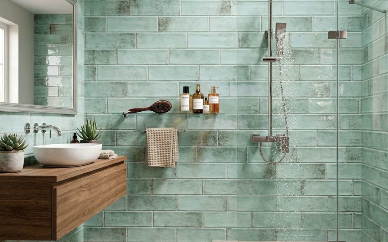
Mint green tiles
Mint green introduces a fresher, cooler tone with a subtle retro influence. Its blue undertones give it a crisp, clean feel that works particularly well in spaces that benefit from a sense of lightness and energy.
This shade is often associated with playful yet refined interiors. When paired with white or chrome finishes, it creates a bright, uplifting atmosphere without becoming overwhelming.
Celadon tiles
Celadon is a softer, more nuanced green inspired by traditional ceramics. It carries a subtle depth that feels both refined and natural, making it ideal for interiors focused on calm and texture.
This shade pairs beautifully with organic materials such as stone, linen and wood, creating a layered and harmonious environment. It is less about contrast and more about quiet sophistication.
Pistachio / Apple green tiles
Pistachio and apple green introduce warmth and energy through their yellow undertones. These shades feel more playful and expressive, making them ideal for accents rather than full-room coverage.
Because they are more vibrant, they work best when used selectively. A splashback, niche or feature detail can benefit from their brightness without overwhelming the space.
Light green tile ideas for bathrooms
Light green tiles can transform a bathroom into a calm, spa-like retreat. Full-wall applications in sage or celadon create a seamless, enveloping effect that feels both luxurious and relaxing.
For a more playful approach, mint green metro tiles can introduce subtle retro charm without compromising on modern appeal. Pairing them with simple fixtures ensures the space remains balanced rather than overly stylised.
Smaller details can also make a significant impact. Consider:
- hexagonal celadon tiles for a textured floor,
- pastel green niches within neutral walls,
- vertical tile layouts to enhance height perception.
Exploring the right light green tile option for your bathroom allows you to tailor the design to both function and mood, creating a space that feels considered and personal.
Light green tile ideas for kitchens
In kitchens, light green tiles bring freshness while maintaining a practical, easy-to-live-with palette. A sage green splashback behind white cabinetry creates a timeless combination that feels clean yet warm.
Mint green metro tiles can introduce a subtle vintage influence, particularly when paired with chrome or brushed steel finishes. This approach works well in kitchens that aim to balance character with simplicity.
For more open-plan layouts, celadon tiles provide a refined, cohesive look that connects kitchen and dining areas.
What colours pair best with light green tiles?
Light green tiles pair best with colours that either enhance their softness or provide gentle contrast. Neutral tones are often the most reliable choice, allowing the green to remain the focal point without overwhelming the space.
White is the most classic pairing, creating a crisp and bright look that works in almost any setting. Warm woods such as oak or walnut introduce natural balance, while brass or gold accents elevate the palette with a subtle sense of luxury.
For more expressive combinations, consider:
- pale pink or terracotta for warmth and softness,
- soft grey for a modern, understated backdrop,
- layered greens for depth and cohesion.
The key is to maintain harmony, ensuring each element contributes to a balanced and inviting interior.
Not sure which light green tiles to choose?
Have a look at our tile collection or visualise your idea in the Free Tile Visualiser!
Glossy vs matte: which finish for light green?
The choice between glossy and matte finishes significantly affects how light green tiles are perceived. Glossy tiles reflect light, making colours appear brighter and spaces feel larger, which is particularly beneficial in smaller bathrooms or areas with limited natural light.
Matte finishes, on the other hand, absorb light and create a softer, more sophisticated appearance. They are often preferred in larger kitchens or more design-led interiors, where texture and subtlety matter more than shine. This finish also tends to be more forgiving when it comes to everyday marks and water spots.
If you are unsure which option will work best in your space, it is worth testing your ideas before making a final decision. Tools like the Free Tile Visualiser allow you to experiment with different finishes, layouts and shades of green, helping you see exactly how glossy or matte tiles will look in a realistic setting.
A practical approach is to match the finish to the room:
- glossy tiles for compact or low-light bathrooms,
- matte tiles for spacious kitchens or feature walls,
- mixed finishes to create depth and variation.
This ensures both aesthetic appeal and everyday usability are carefully balanced.
Conclusion
Light green tiles offer a unique combination of freshness, calm and flexibility that few other colours can match. They adapt effortlessly to different rooms and styles while maintaining a sense of balance and subtle elegance.
By understanding shades, finishes and complementary colours, you can use light green tiles to create interiors that feel both contemporary and enduring. The key is thoughtful selection rather than following trends blindly.
When chosen carefully, light green tiles become more than a surface – they shape the entire atmosphere of a space in a quiet, confident way.
FAQ
What is the most popular light green tile shade?
Sage green is currently the most popular light green tile shade because of its timeless appeal. Its muted, grey undertones allow it to work across a wide range of interiors without feeling too bold or too neutral. It is particularly favoured in kitchens and bathrooms where a calm, cohesive look is desired. Unlike brighter greens, sage adapts easily to changing trends and materials.
Do light green tiles make a room look bigger?
Yes, light green tiles can make a room look bigger because they reflect light and create a sense of openness. Softer shades reduce visual contrast, helping surfaces appear more continuous.
This effect is especially noticeable in smaller bathrooms or kitchens with limited natural light. When combined with glossy finishes or light grout, the sense of space can be further enhanced.
What grout colour for light green tiles?
The best grout colour for light green tiles depends on the desired effect. Matching grout creates a seamless, calm surface, while slightly darker grout adds definition and highlights the tile layout.
Can I use light green tiles on floors?
Yes, light green tiles can be used on floors. They can add subtle colour without overwhelming the space. Matte finishes are often preferred for flooring, as they provide better grip and a more natural look. Patterned layouts or textured tiles can also enhance visual interest.